As part of a public health accreditation process, I helped spearhead a rebranding campaign for the Baltimore City Health Department. The project included updated graphics, templates, brand guidelines, and an agency-wide strategic implementation plan.
Vision
An equitable, just, and well Baltimore where everyone has the opportunity to be healthy and to thrive.
Mission
To protect health, eliminate disparities, and ensure the wellbeing of every Baltimorean through education, advocacy, and direct service delivery.
Excerpted from the post I wrote on the BCHD Blog:
The main goal of the agency rebranding was to standardize communications, which allowed us to build recognition, connections, and trust in our communities. BCHD has been operating since 1793. From its inception, the department has grown from addressing yellow fever outbreaks to the expanse of our work today: animal control, restaurant inspections, violence prevention, HIV/STDs, lead poisoning prevention—the list goes on.
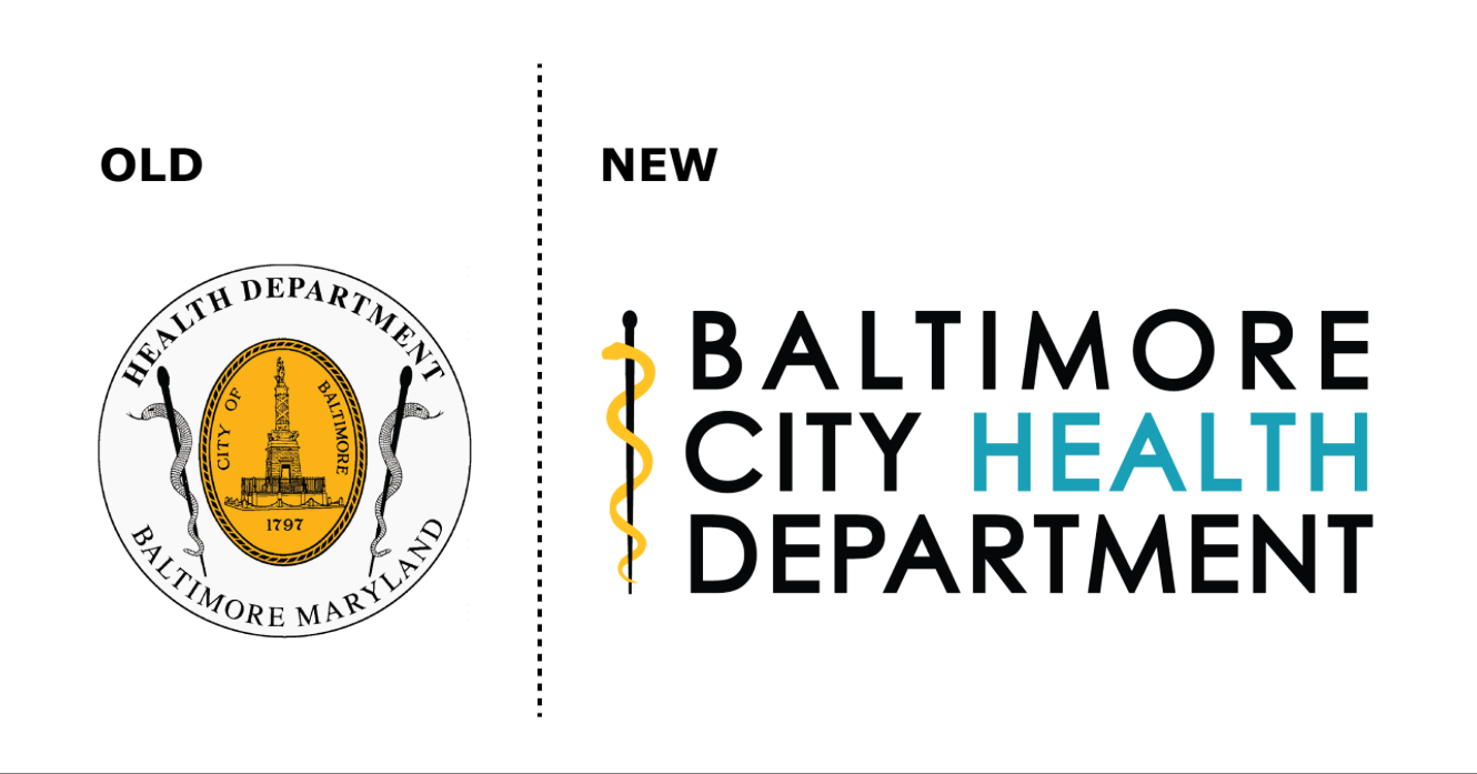
Over the years, as our divisions and programs expanded, different versions of our logo proliferated. As a result, few people were able to identify our agency and programs based on the logo. Our old logo was hard to read, especially when made smaller.
By creating a new logo that is modern, simple, and clear to read, we have made it much easier for our communities to know who we are when they see our documentation, regardless of what part of the agency is producing the resource.
The most visual change with the new logo was updating from the “crest” to a combination mark of typography and icon. The typography base is modern and simple, which makes it easy to read, even at a small size. We wanted to emphasize the idea of “City Health,” and even more specifically “Health,” which is why it is the only word in the light teal blue color. The icon is based on the Rod of Asclepius, which pays homage to our original logo and references the ancient Greek god of medicine and healing. We maintained the connection to Baltimore with black and gold colors and added the teal blue as an accent that nods to the public health community.
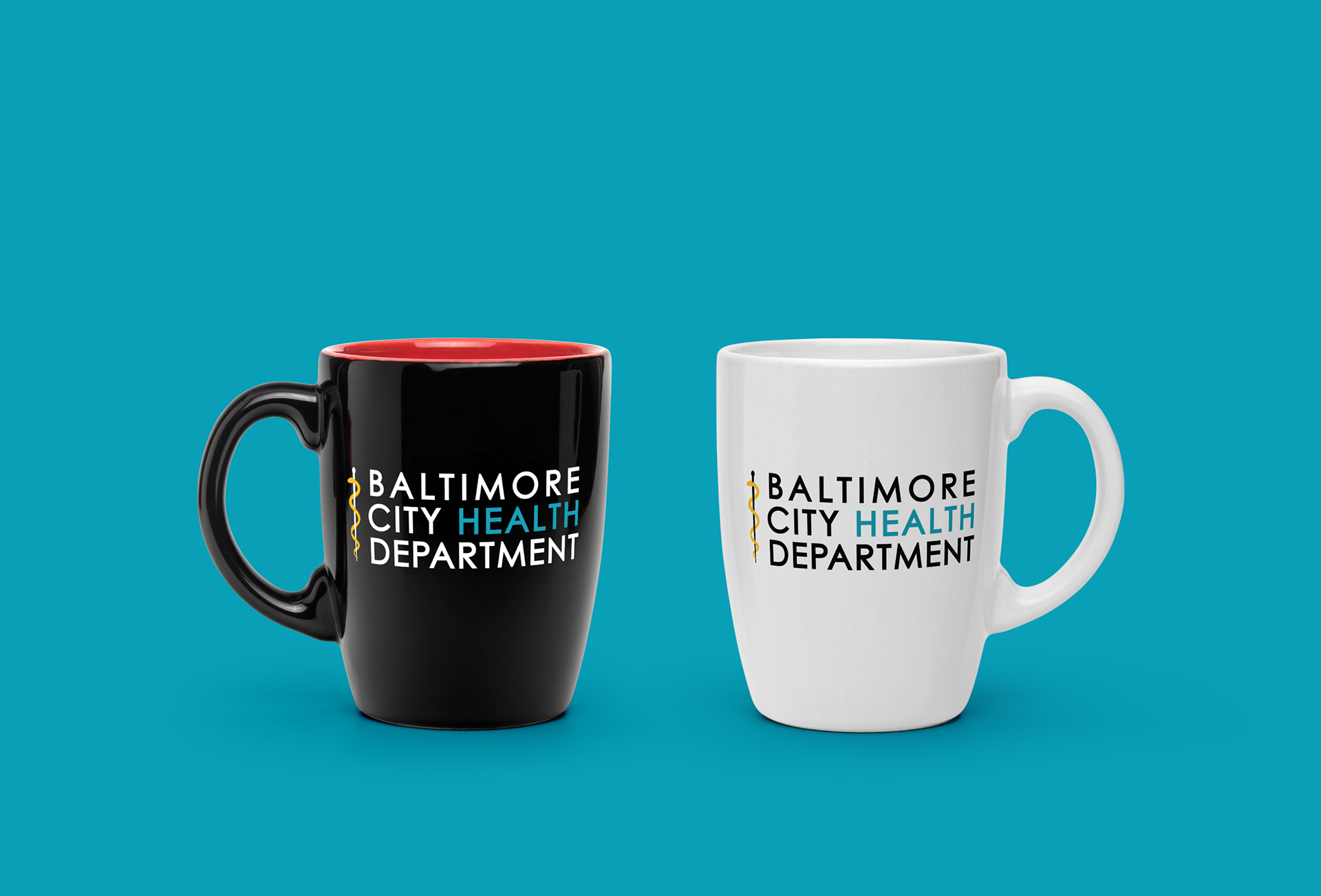

We needed a version of the logo that could scale really small for printing on fliers, so I removed the Rod of Asclepius from the larger logo.